Designing a Logo for a Children’s Book Series: Tips & Process 🎨📚
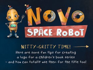
Designing a logo for a children’s book series is an exciting, creative process that requires a deep understanding of both design principles and the essence of the story. A logo is more than just a pretty image; it’s the first visual impression of the book, setting the tone and inviting readers into a magical world. Whether you’re working on the book title design or creating a logo specifically for a series, here are some essential tips to help guide you through the design process.

1. Focus on Details
Children have a keen eye for detail. They notice things that adults might overlook, so every element of your logo matters. To make your logo truly resonate with young readers, reflect aspects of the story—whether it’s a memorable character, an iconic object, or a unique setting. By focusing on these details, you can create a logo that connects directly to the story and evokes an emotional response from your audience.
2. Incorporate Character Elements
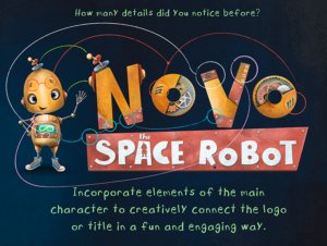
One of the most effective ways to make your logo unforgettable is to incorporate elements from the main character or the world they live in. Whether it’s a recognizable part of the character’s design or a feature of the fictional world they inhabit, these elements help create a visual bond between the logo and the story. This technique ensures that the logo feels truly connected to the heart of the book, making it more memorable for readers.
3. Play with Typography
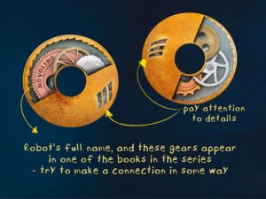
Typography is a fun and powerful tool in logo design. By experimenting with different letter shapes, sizes, and styles, you can inject energy and personality into your logo. Playful, quirky fonts can bring a sense of fun, while bolder or softer fonts can reflect the tone of the story. Don’t be afraid to get creative with the text—after all, the way you present the book’s title can be just as important as the illustrations.
4. Hide Easter Eggs
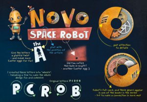
An Easter egg is a subtle, hidden detail that adds a layer of intrigue to the design. Adding small, secret elements to the logo encourages children to explore and discover new things each time they see it. These hidden surprises not only spark curiosity but can also give readers a sense of reward when they spot something new—just like uncovering a secret in the book itself!

5. Ensure Cohesion
While it’s important to be playful and creative with your design, it’s equally crucial to ensure that the logo feels cohesive. The elements you use should come together in a balanced way that is visually appealing and easy to understand. The logo should effectively represent the series and convey its themes, so take the time to adjust and fine-tune until the overall design feels just right.
Final Thoughts
Designing a logo for a children’s book series is an opportunity to visually tell a story before the first page is even turned. By focusing on details, incorporating character elements, experimenting with typography, adding Easter eggs, and ensuring cohesion, you can create a logo that not only captures the essence of the book but also excites and engages young readers. Remember, the logo is often the first impression of the series—make it count!
